WAVE Accessibility Check

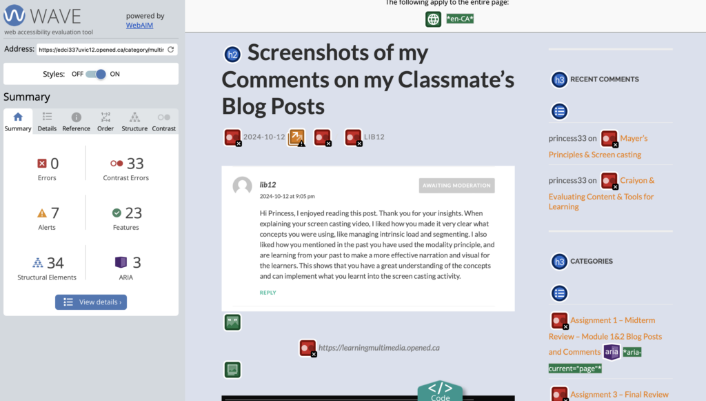
After completing the WAVE accessibility check I was surprised by how many different elements there was to evaluate the accessibility of my Website and just how quickly WAVE was able to access my website and also provide me with the code of it. The main thing I found after the report was the amount of contrast color errors I had in my website. It did make me realize that I could definitely use different contrasting colours to enhance my website so am I going to switch my theme to new colours that have a higher contrast.
Canva Infographic

I followed the six promising practices for creating an infographic design. I limited my color palette, only using high contrasting colors, dark navy, and white, and yellow for the design appeal. I kept my imagery simple, only adding in some photos of animated dogs to fill in some space. I was consistent with style choices, and kept some white space instead of just filling it with unnecessary images. I used two fonts, one for headings, and one for my textbox. I also kept the same font size for each heading, and each textbox. I found a template I liked on Canva and then took inspiration from it and resigned the shapes, and fonts, removed images and implemented my own but still kept the existing layout. By using a template I find it is easier to start the infographic and get information down, but it can also make it harder to keep simple, as I found myself keep wanting to add more little touches to make it more “my own”.
Accessibility for Learners with Visual Impairments
To ensure learners with visual impairments have equal access to infographic content in an online setting, several modifications can be implemented. Adding detailed alternative text (alt text) for all visual elements allows screen readers to convey the information effectively. Providing a plain-text version summarizing the infographic ensures accessibility for those who cannot interpret visual content. High-contrast color schemes should be used for readability, avoiding reliance on color alone to convey meaning. Descriptive captions for charts or images and simplified text enhance clarity. For online formats, interactive audio descriptions or voiceovers can narrate the infographic’s content. Below all of these design principles is the recognition that disability isn’t a lack of ability, it’s a mismatch between a person’s abilities and their environment (Holmes, 2019). These measures collectively make infographics inclusive and accessible to all learners.
My Comment on Classmates Blog

One response to “Module 4: Design Principles for Effective and Accessible Multimedia”
-
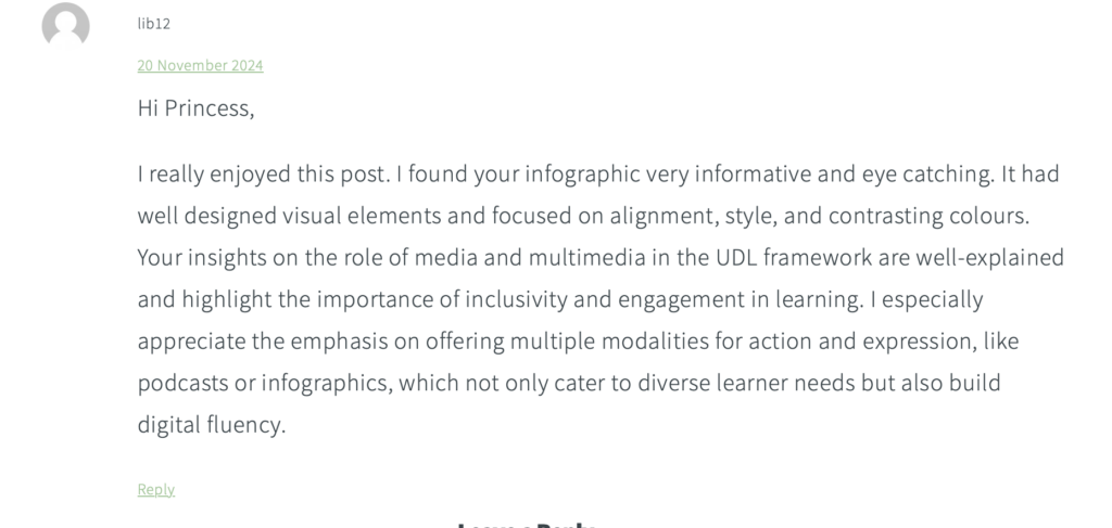
This is a great reflection on accessibility and design principles! It’s impressive how you’re applying insights from the WAVE report to improve contrast on your website—those changes will definitely enhance usability. Your infographic design process sounds thoughtful and methodical, especially with your focus on high contrast, consistency, and simplicity. I also appreciate the emphasis on accessibility for learners with visual impairments; your suggestions like alt text, captions, and audio descriptions show a strong commitment to inclusivity. Well done!
This is a great reflection on accessibility and design principles! It’s impressive how you’re applying insights from the WAVE report to improve contrast on your website—those changes will definitely enhance usability. Your infographic design process sounds thoughtful and methodical, especially with your focus on high contrast, consistency, and simplicity. I also appreciate the emphasis on accessibility for learners with visual impairments; your suggestions like alt text, captions, and audio descriptions show a strong commitment to inclusivity. Well done!